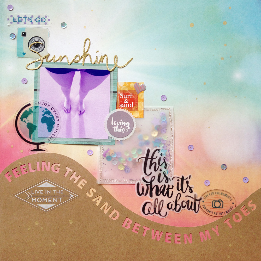
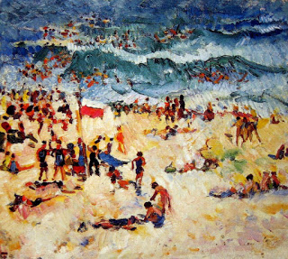
I am absolutely in love with this layout! I adore how it turned out (even prettier than I had pictured it!). This layout is my first DT layout for the ARTastic challenge blog. When I saw the inspiration picture, I immediately knew what paper I wanted to use and what I wanted to express with the layout. The painting that we were inspired by this month is called Bondi Scene by Isabelle May Tweddle.
The challenge criteria was summer theme. I love summer, and sun, and all things hot ;) and especially the beach. I used a photo that I took at the beach of my feet in the sand and surf.
The only slight fail of this layout is that my printer was low on ink, so the photo printed blurry and purple. The purple works with the layout, the blurry however… well I might have to reprint and layer it over. But I will keep it as is for now. The paper was Shine on from Simple Stories’ Summer Vibes collection. It is soooo pretty and I wish I had bought more than one. In fact I managed to save a little bit from under the kraft paper wave ;).
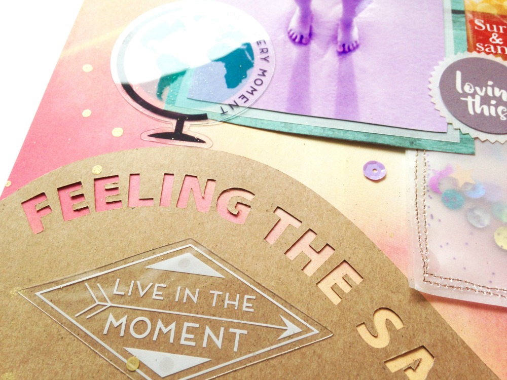
The wave was cut with my Silhouette using the free font Cleanvertising, which is perfect for cutting letters where you want to keep the middle bit. I made the wave as short as I could because I didn’t want to cover up any of that prettiness that is the background paper. That’s also why I gravitated towards the clear acetate shapes in Pink Paislee’s Atlas ephemera pack. I made my main design element- the shaker pocket- from vellum, so you can see a bit of the background colour through it.
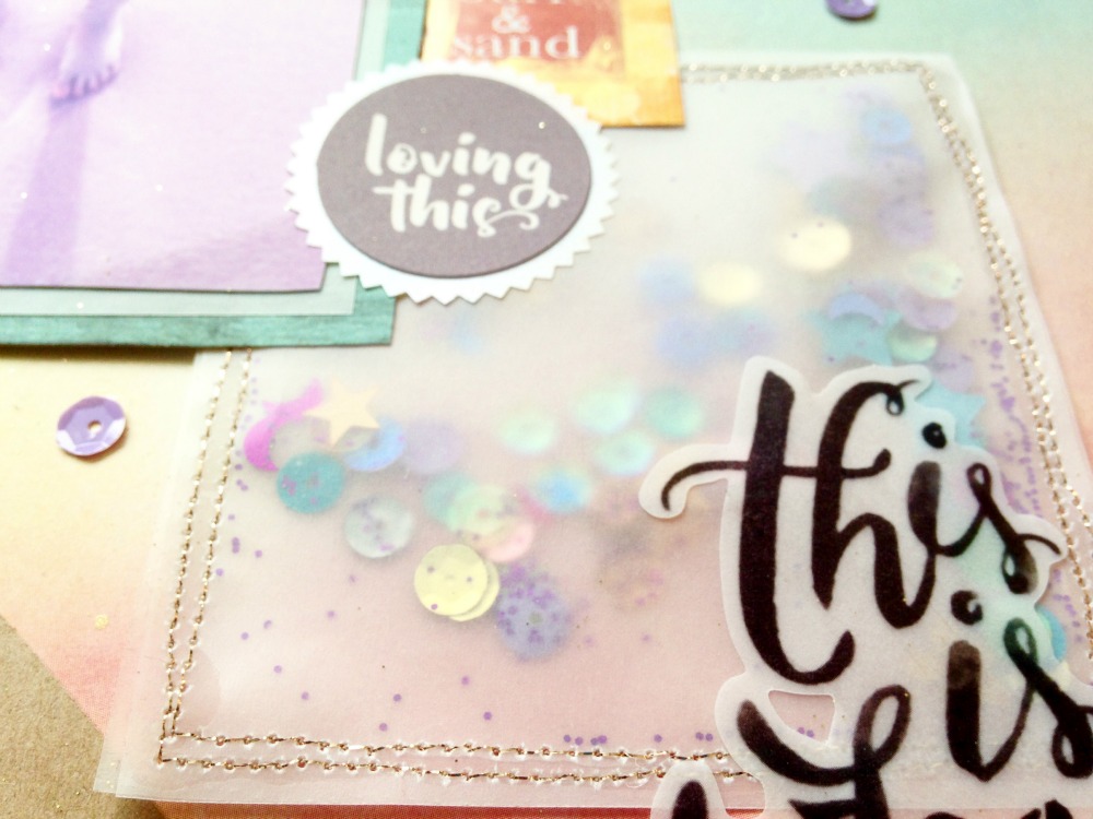
I also used a vellum phrase from Maggie Holmes Open Book vellum ephemera pack, again to let the background peek through. I kept the layering behind the photo minimal, for the same reason.
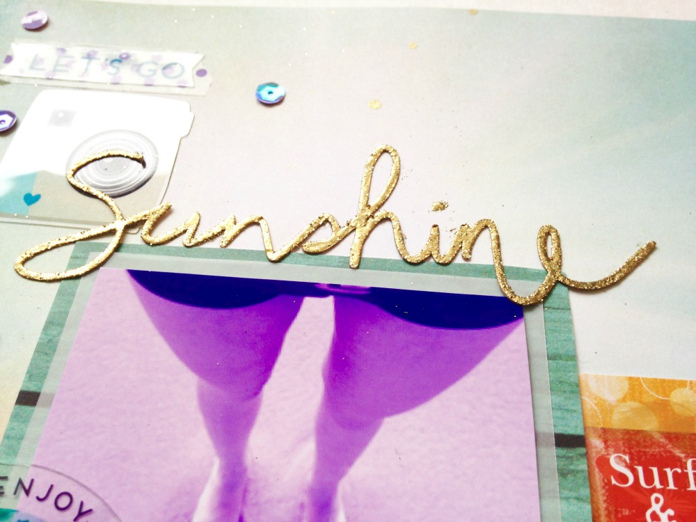
I used a stylus on my new Surface tablet to “handwrite” the word sunshine, cut it from cardstock on my Silhouette, and double embossed with gold embossing powder. I’m really pleased with the way that turned out as well.
I tried to keep most of the stuff going down the middle diagonal of the page, and leaving the majority of the upper right side clear. For some reason, I find it very hard to leave negative space on a layout, I always feel this need to fill all my space. But I did it! Yay! (well mostly, I couldn’t help splatter a bit of gold shiny… but look how pretty!!)
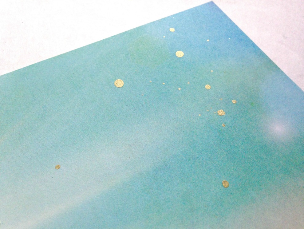
Oohhh. I admit this paper is doing a lot of the heavy lifting for this layout :D. I wonder if I could try to recreate this effect with my husband’s airbrush on a piece of white cardstock?
xoxo
-A


One Response to ARTastic Design Team – January Challenge