This page….. I had the concept, the inspiration, what I didn’t know was what photo and quote to use! I procrastinated starting this for so long. Eventually, Dylan said to me: Just start the background, the rest will come.
Our ARTastic inspiration this month is “We will remember” by Josh Miels, and the criteria was typography.
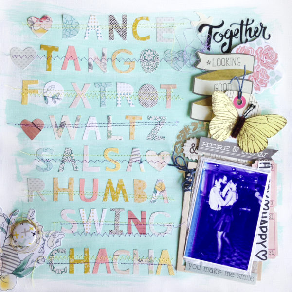
I love typography and I had so many ideas! Ultimately, I settled on handcut letters arranged to spell out a quote, and a greyscale photo, as well as grey elements in the embellishments, as I wanted the background and words to be pretty colourful.
I started the background- white cardstock with gesso, and mixed up some minty/seafoamy green paint. I didn’t want my layout to be all grey, it’s spring and I am craving colour! I used a foam brush to brush it on all over the background. Then I cut out some embellishments. Then I procrastinated trying to find a quote on Pinterest that would go with one of the photos I had and was long enough but not too long.
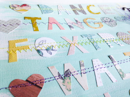
I actually got the idea for dance names instead of a quote from a poster I saw browsing my feed on Pinterest after I had given up! It was the perfect length, and it went with a photo of my and my husband dancing at the studio where we take lessons in all those ballroom dances. The way I cut my letters was a bit…roundabout. I used Studio to size and arrange the letters and then cut them out using a free handcut letter font. But I didn’t want them to all be the same handcut letters… so I just cut them on plain paper and used that as a stencil to draw the letters on the backs of my pattern papers and used that as a guide for the size/orientation of each letter. So they are in fact hand cut.
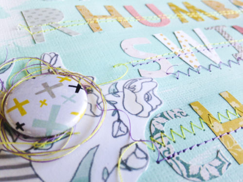
I fussy cut a flower for the corner from one of the papers I used. By the way, I used mostly my really old Scraptastic Club kit that I’ve been making last for a long time! The papers in it are so pretty and they went with my background really well. The flair is from the kit as well and I nested it in the same thread I used to sew down my letters.
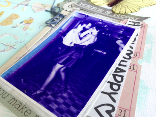
I have issues with my printer. Or it just knows me and knows I like purple so it tries to print my photos with a purple hue. Either way, my black and white photo came out purple. It’s pretty and cool though so I used it anyways. I layered it on some tissue paper, a grey paper from my stash, some tickets, and a sun-faded chipboard frame.
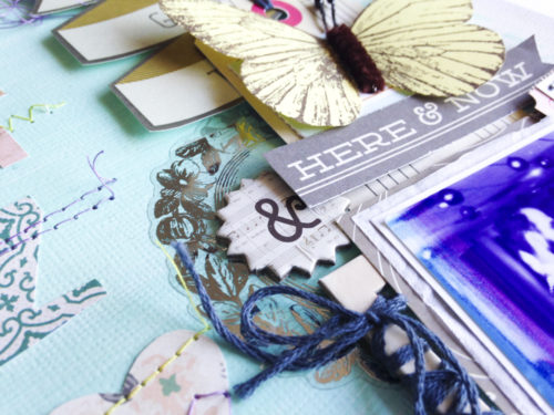
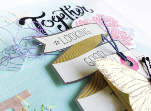
This butterfly came with the kit as well and I have been determined to use it. I layered it on a music note tag from a CP Flea Market cut apart sheet, with a tab from the kit and a banner from my stash of things with words on them. I layered the whole thing over a silver frame sticker from the dollar store and added an alpha from AC-“Celebration”. The music notes go with the theme and I love how these thickers can be used by themselves as an embellishment!
I also fussy cut this banner from a project life card, layered that over a chipboard thicker from Theresa Collins Save The Date flower, and a vellum piece from the kit (Maggie Holmes Open Book).
Once I actually started the process everything came together! The longest part was hand cutting all of those letters but I think the end result was worth it.
I hope that I’ve inspired you to make a layout with typography the main element. If you do make one, don’t forget to submit it to the ARTastic challenge for a chance at fun prizes!
xoxo
-A