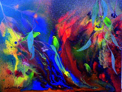
This month on the ARTastic blog, we were inspired by the lovely painting called Green Lorikeets, by Cathy McClelland:
I was immediately taken by the splattery paint and feather-like leaves and birds. The challenge criteria for this was to use paint on a layout. I knew right away I wanted to splatter/smoosh a lot of paint on a piece of paper and then cut shapes out of it. That way, I could use the crazy neon bright colors and not have it overwhelm my whole layout.
This was an 8×8 layout, so I took a piece of 12×12 cardstock and cut it down to size. Then I took one of the scraps from that and covered it in gesso. I also covered the back in gesso once it was dry, as suggested by my team co-member Lizzy Hill in the latest 3T’s post. Once it was dry, I took out my gouache paints and picked out a rainbow of colors to mimic the colors in the painting. I diluted the paint with water on a piece of packaging and used the packaging technique to apply color all over the piece of paper. I also used the excess to add splatters. I went from the lightest color (yellow) to the darkest (blue/purple), letting it dry (ie, blasting it with my heat gun cause I’m impatient) between each layer. It turned out SO pretty I didn’t even want to cut into it. But I did.
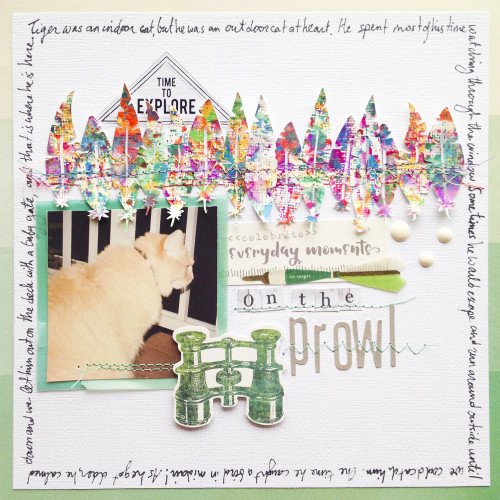
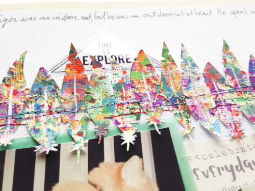
I designed some feather cut files and scaled them down to fit on my layout. I packed as many as I could into the space I had, and cut them. I used the textured cardstock setting in Studio, and before cutting I lowered the speed down even more and selected double cut. Because of the nature of the painted paper and the tiny size and amount of detail in my cut file, it wasn’t the cleanest cut. BUT it looked like feathers, which was what I was going for. I chose the prettiest/least mangled feathers for my layout and arranged them across the page. I added a few at a time and stitched through with different colors of thread and different stitches.
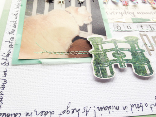
This was actually one of the few layouts where I had a concept before I knew what photo I wanted to use/what story I wanted to tell. Eventually I decided on a picture of Tiger hunting birds from the deck. It fit the bird theme so I went with it. I wanted to keep everything else in the layout light and neutral so as to not compete with the feathers.
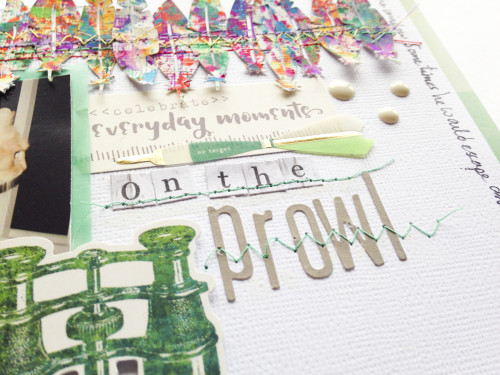
I went with a minty green and grey color scheme, using pieces ephemera from MME’s Now and Then Happenings, Maggie Holmes Open Book, Pink Paislee’s Atlas and Elle’s studio. The alphas are MME’s Necessities Wood and Jillibean Soup Mushroom Gray. I backed the photo with green vellum and the whole layout with ombre stripe paper, both from Crate Paper’s Flea Market collection.
Look at the little hunter! I decided to use journaling as a frame around my layout. I started by writing it out in Silhouette Studio and using the text-to-path feature to make it square and the right size. I then picked a font that made it fit around the square perfectly. I used a marker to do a test run on scrap paper, but ended up not liking the font at all. After a lot of deliberation and browsing fonts, I bit the bullet and decided to use my own handwriting! I used the scrap sketch as a guide on how big to make each word so that it fit perfectly, and used a pencil at first so I wouldn’t mess up. And I’ve got to say, I’m pretty happy with the end result!
I hope I’ve inspired you to get a little bit of bright paint onto your layout, even if it’s in small doses like this. If you do create something inspired by the painting and using paints, come on over to the ARTastic blog and link up! You could win a really awesome prize pack!
See you there!
xoxo
A





One Response to February ARTastic DT- On The Prowl Scrapbook Layout