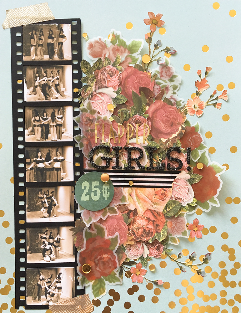
I have been hesitating posting this layout, because I’m not sure I’m 100% happy with the title. I look at it in real life and it looks fine, but in the photos, it is barely legible because it’s so shiny and it needs movement to stand out. Otherwise, I love the way this page turned out. The challenge over at ARTastic blog this month was vintage and/or children. The inspiration was this art piece called The Kite by Ethel Spowers: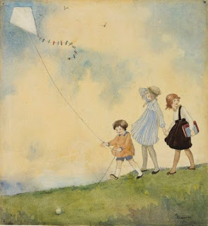 Obviously not having any children in my life, I chose vintage. Generally I find it difficult to do vintage style and make it me. I was stuck on a photo to use for something vintage, until I remembered that my dance troupe did a flapper inspired choreography.
Unfortunately I couldn’t find any photos, but then I remembered there was a video. And I’m kinda glad because it gave me the idea to do a film strip! I took a bunch of screen shots, edited them sepia style, and used the print and cut feature on my Silhouette Cameo to print them the right size for the film strip cut file that I made. 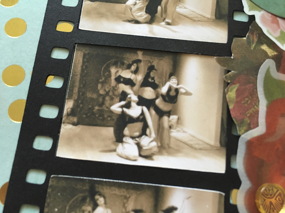
I was going to go with a black, white and gold art deco theme, but then I saw this paper and decided I just had to use it. I thought it would also look great with pink and red roses, so I started fussy cutting. I have a whole paper pad of vintage style rose patterned paper. I also print and cut some roses on vellum, which is a technique I definitely will be using again to make vellum embellishments!
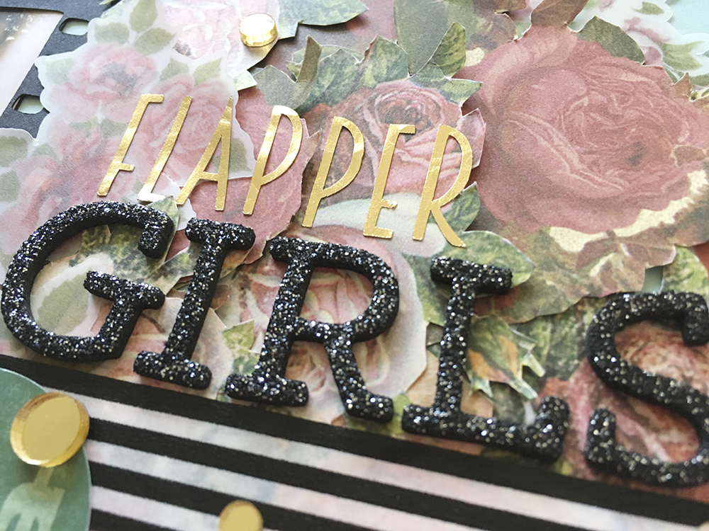
I added a strip of striped washi tape to ground my title. I love those black glitter foam alphas from Heidi Swapp, and I’m happy with that part of my title. For the flapper part, I cut them on my Cameo from some gold foil tape. See it looks ok in this photo cause the light is hitting it just right, but on the full page photo, it’s barely visible. I didn’t want to add gesso because I didn’t want to flatten the roses or warp the vellum. I’m trying to decide if I want to replace them with gold mini alphas, or add some vellum under the word. Or keep it as is? Thoughts?
The last added touches were a little 25c circle die cut- no real meaning, just wanted something round and teal and vintage, and some gold mirror acrylic dots. Both My Mind’s Eye, the dots from Yes, Please and the die cut from Then and Now.
Other than my title issues, I LOVE the way my design turned out. I love the roses and the colours and the film strip. I managed to make it vintage and feel like me and my style.
Thanks for joining me!
xoxo
A