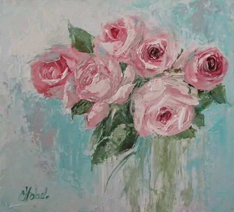
The gorgeous inspiration painting for this month at ARTastic is Pink Roses by Chris Hobel.
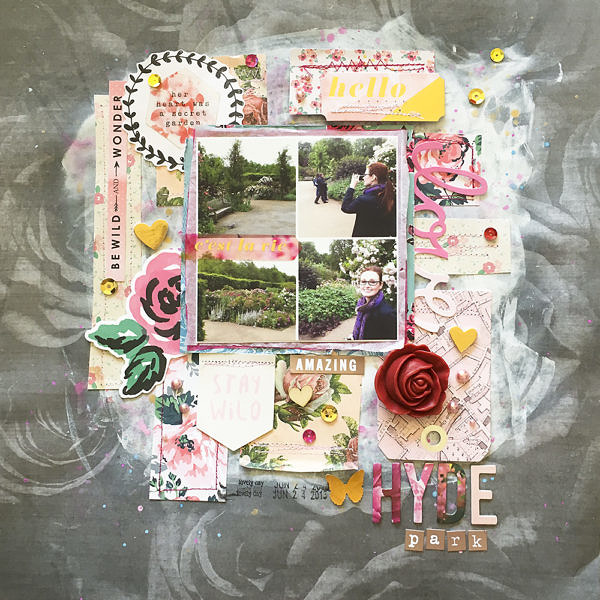
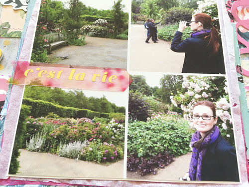
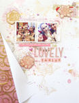
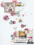
I love roses and I love the grey and blue with the pink, wand a few hints of green. The challenge was to use pink. My love of roses and the challenge inspired me to scrap photos of the Queen’s rose garden in Hyde Park in London. I love visiting rose gardens in whatever city I’m travelling to. I was also super pumped to finally use this gorgeous greyscale rose paper. I got it at the dollar store, and I’ve had it for a long time. This was the perfect layout for it and I was super excited to use it.
I had a vague idea about what I wanted the layout to look like- a square of photos in the middle, layered over some scraps of paper that were tiled but not touching, over top of some mixed media. I applied white gesso to the background for the mixed media and almost cried cause I thought I ruined my beautiful paper. But as it dried and I played with my papers I realized I could still clearly see the roses around the edges and the white would really make my mixed media stand out and not soak into the paper (which was really thin), and I was going to cover most of it up with papers and embellishments anyway. It also became slightly more translucent as it dried. I then applied pink and blue watercolours with packaging and splatters, as well as gold splatters, and I was quite a bit happier with the result.
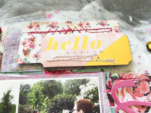
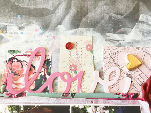
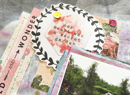
I went through all of my paper stash and pulled a bunch of rose patterned papers. I cut one or two rectangles of each and arranged them over my mixed media. I then stitched them down, because they would not stick to the mixed media otherwise. Under my photos, I have layered a blue rose paper (dollar store too, and Cute Girl) and some pink and white tissue paper.
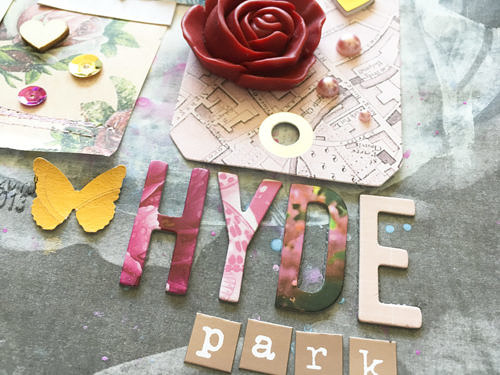
I wanted the majority of my embellishments to be pink and gold. I pulled from a bunch of different collections for it- Cute Girl and Bloom (Crate Paper); Atlas and Take Me Away (Pink Paislee).
I also used C’est la vie from Pink Paislee- the acetate pieces and gold embossed embellies are gorgeous and perfect for this layout.
I wish the photos could capture just how lovely that garden was. I also wish I had gotten a better picture of those super fat London pigeons!
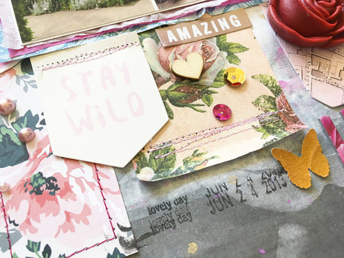
For my title I used the pinkest letters from the Bloom Petals thickers pack and the rose gold mini alphas from MME’s Metallic Necessities. Final touches included pink enamel dots, sequins, a date stamp (Dear Lizzy), a punched gold butterfly, a wood veneer heart, and that gorgeous enamel rose that a scrappy friend gave me.
I took a very literal approach to the inspiration painting. But there’s so many things you can do with it. I’d love to see what you come up with! Hop on over the ARTastic blog to see what approach the rest of the team has used and link up your own!
xoxo
A
