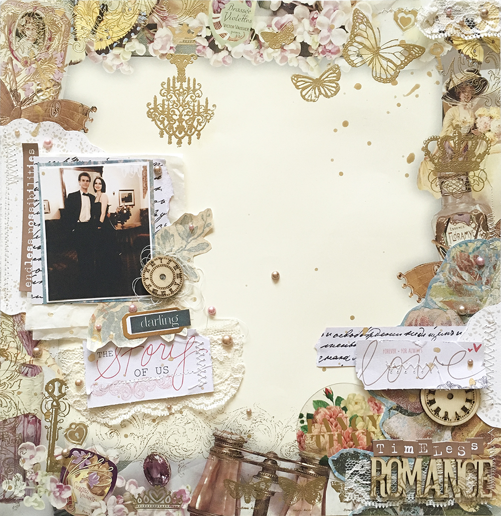
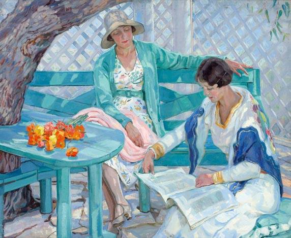
I love this photo of me and my husband. It’s timeless- there is nothing to indicate what decade this is from. So when I saw that the challenge for this month at ARTastic was vintage style, I immediately though of this photo. I also knew this was going to be a huge challenge for me as vintage is completely out of my comfort zone. The inspiration painting is The Summer House by Hilda-Rix Nicholas.
I also instantly though of this gorgeous vintage style paper than my friend Chantal gave me for my birthday last year. The pattern of stuff around the edges and the negative space in the middle really inspired my design for the layout.
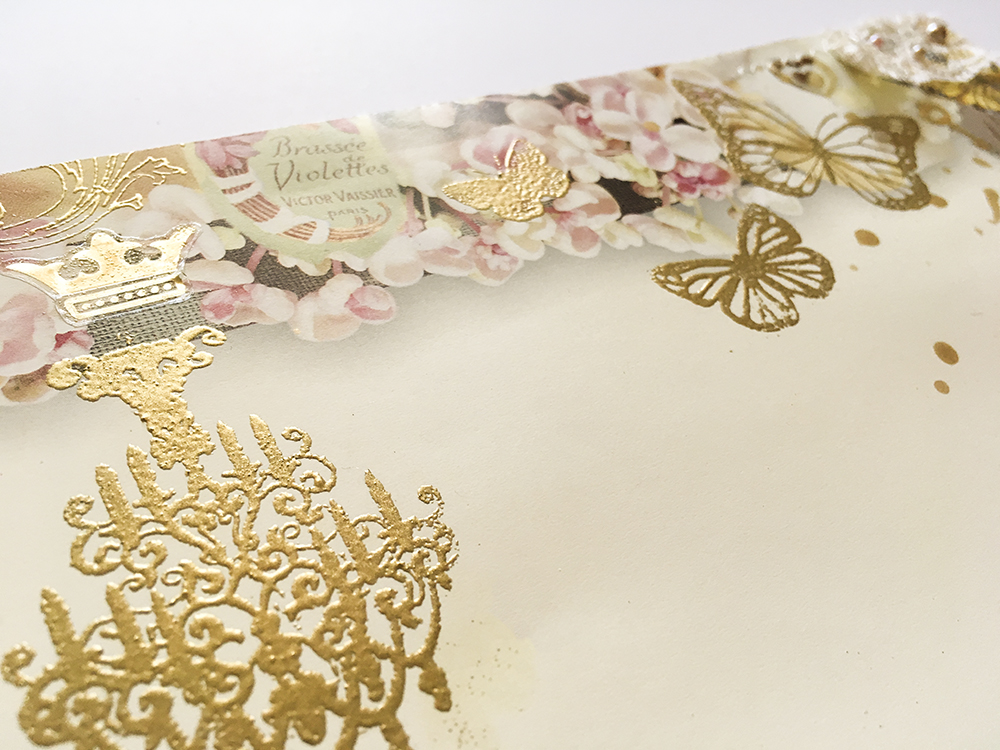
The paper already had the pretty vintage things around the edges, but I wanted some shiny gold texture. I went through my stamp collection for vintage looking stamps and used gold embossing powder to add interest around the edges. I adore this chandelier stamp from the dollar store- and since the photo had a chandelier in it, I thought it would be cute hanging at the top of the layout into the middle.
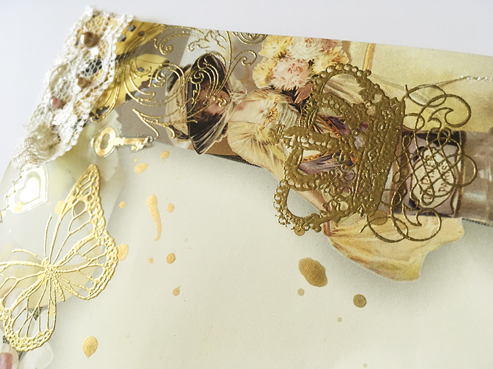
I used some gold stickers (also dollar store) and they got a bit melty/warped when I added more heat embossing. I really liked the effect though so I melted all my stickers a little bit. I found some scraps of lace and pearl enamel dots to decorate the page with.
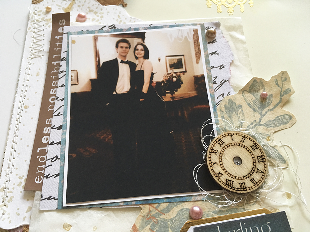
I used a bunch of papers from the Save the Date collection by Teresa Collins. I fussy cut the doilies from a doily patterned paper, and I thought the script paper went perfectly. The blue paper and rose is from a vintage paper pack from the dollar store. I wanted to add a few hints of blue as inspired by the painting. I was also excited to use those wooden clocks- they were my DT special mention prize from a couple of months ago from Jane! I added a bit of tangled thread underneath it for some extra texture.
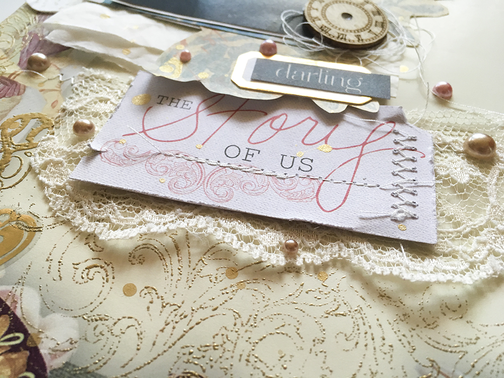
I cut some cute sayings from a cut apart sheet in the Save the Date collection. I also added some ephemera from Pink Paislee’s C’est la Vie- the little gold frame under the darling, and the Fancy That acetate piece.
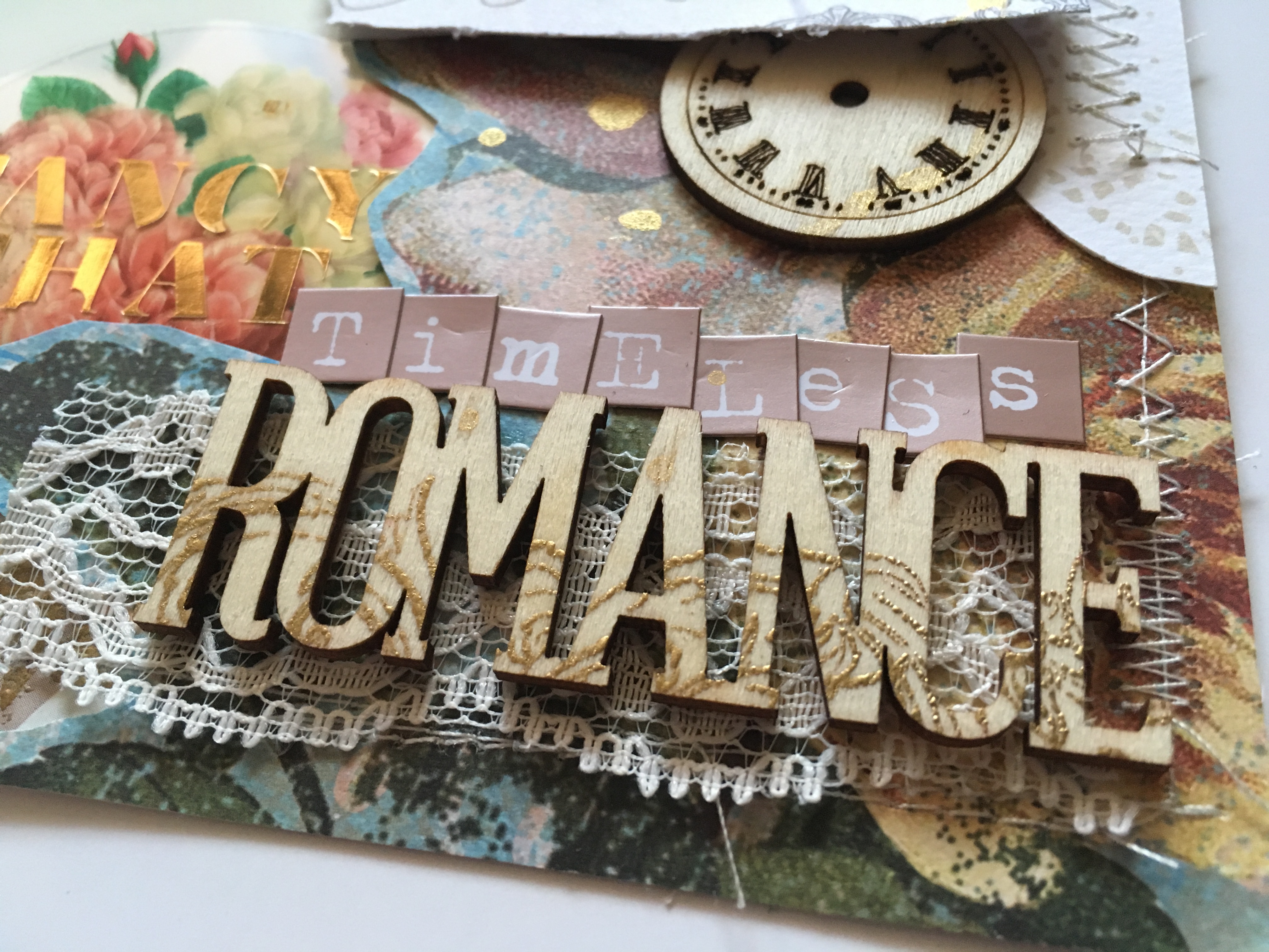
The mini alphas (as well as the phrase sticker by the photo) are MME’s Metallic Necessities in rose gold. I used the same swirly stamp that I used around the edges on the Romance wood piece (from Michael’s) and gold embossed it for extra texture. Before I glued everything down, I stitched all over the page in an off white thread. Last touch was a splattering of gold paint. When I showed my husband he said “What’s with all the space in the middle, shouldn’t you put a photo there?” I said it’s negative space!! It’s design! I hope you enjoyed this layout, and are inspired to try working with negative space. Link up over at the ARTastic blog!
xoxo
A